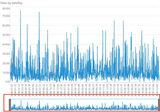
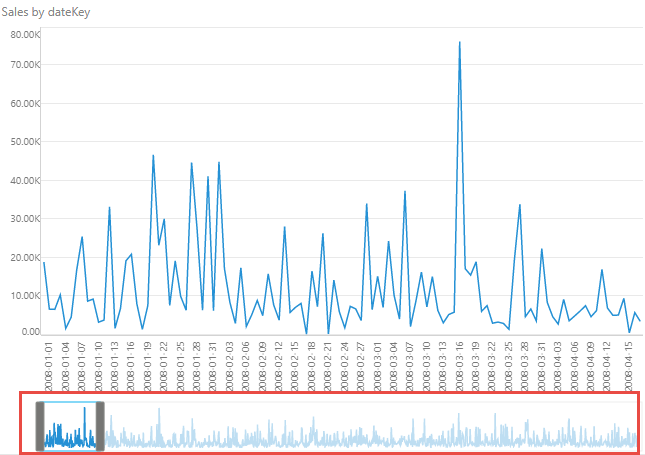
The range slider is available in both Discover and Present, and is used to zoom in and out of Cartesian charts that contain large amounts of data. A Cartesian chart that contains many elements on the x-axis can be very difficult to navigate and read. Take, for instance, the line chart below, which shows sales by date. Such a chart can be quite challenging to interpret. While sometimes the solution may be to reduce the amount of data in the chart (for instance, by looking at months instead of dates), other times this isn't desirable.
The range slider is seen in the visual both in Discover and when it is included in a presentation at runtime, but can be enabled and configured in Discover Pro, Present Pro, and when viewing the runtime version of the presentation (right-click Show Range Slider).
Note: Where the range slider appears depends on the visualization type and configuration in Discover Pro; Line charts, Area charts, and Bar charts may include a horizontal range slider which may be configured to appear above or below the visual; Column charts may include a vertical range slider which may be configured to appear to the left or right of the visual.
Watch the following video for a demonstration of the Range Slider:
Range slider appearance
The range slider is visible on a visual in the editor and also when it is included in a presentation at runtime. You can use it to zoom in on a particular section of your Cartesian chart and view its details. In the following case, the range slider is shown beneath a Column chart (purple highlight) with the visible panel (green) selected using the two handles (blue arrows).
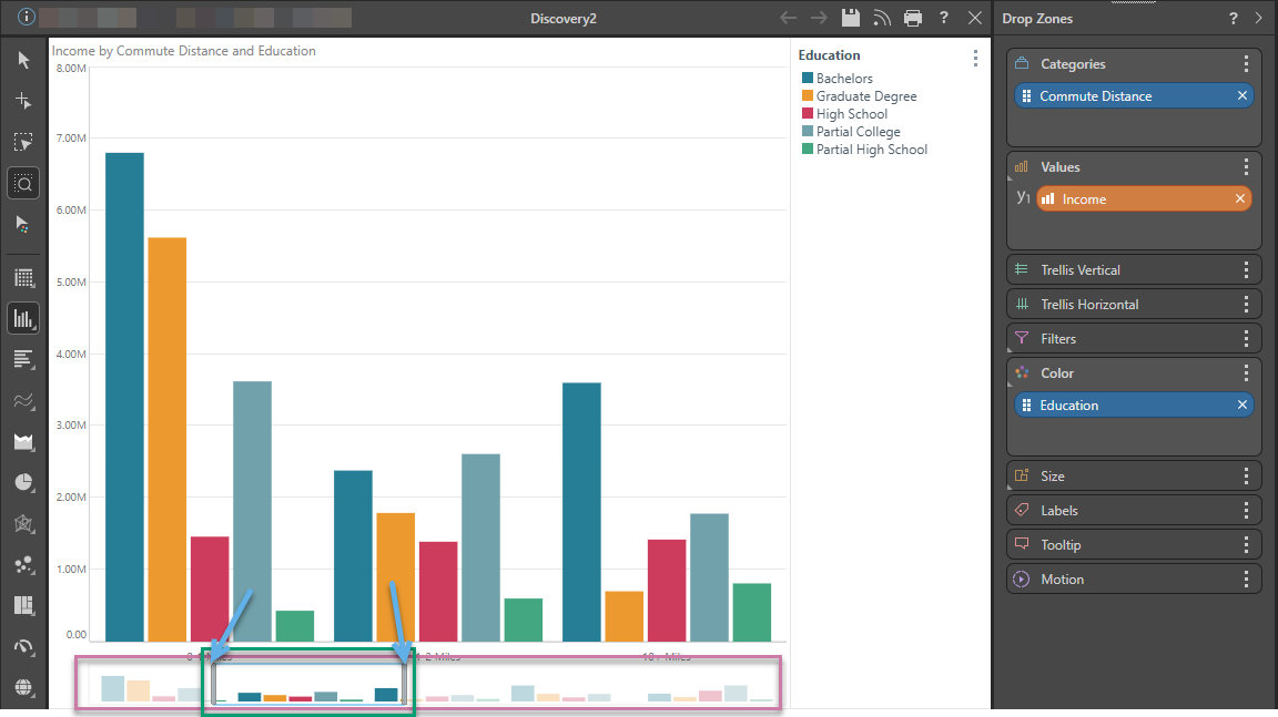
Enabling the range slider provides a way for the user to easily navigate and interpret the chart:
- The range slider shows the full range of the chart (purple box above).
- The selection panel (green) indicates the part of the chart that is currently displayed.
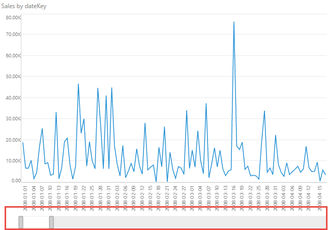
- You can drag the whole of the inner box to the right or left to display a different range of data.
- You can use the handles of the slider (blue arrows) to zooming in and out of the chart (expanding or reducing the amount of the chart that is shown by changing the size of the zoomed area).
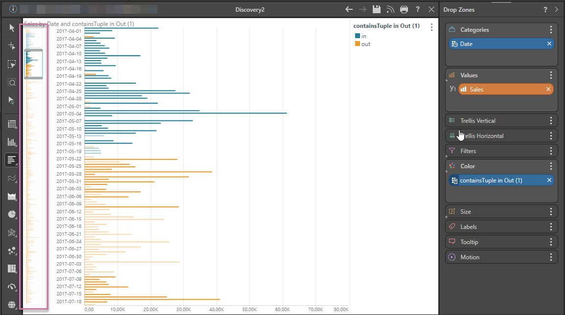
When working with bar charts, the range slider is displayed on the side of the canvas:
Enabling the Range Slider
The range slider can be enabled from the Component ribbon, from the right-click context menu on the visual's background, or when using the Zoom Lasso.
Component ribbon
From the Component ribbon:
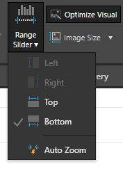
- Toggle the Range Slider button to turn it on or off.
- Open the Range Slider dropdown list to change the slider's position on the canvas, or enable auto zoom.
Context menu
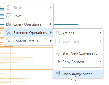
From the visual, right-click on the chart background and select Show Range Slider from the context menu:
Zoom Lasso
When you use the Zoom Lasso in the Toolbox to select or classify an area on a Bar Chart or Column Chart, a Range Slider is added to your chart. The "zoomed area" inside the range slider matches your selection when dragging your lasso on the canvas and you can change your slider settings as described below.
- Click here for more information about the Zoom Lasso
Disabling the Range Slider
To turn off the range slider:
- Click the Range Slider button on the Component ribbon.
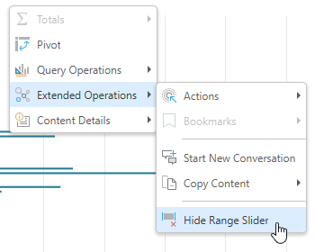
- Right-click the chart background or the range slider itself and select Hide Range Slider from its context menu:
Range Slider Settings
Right-click anywhere on the range slider to edit its settings from the context menu.
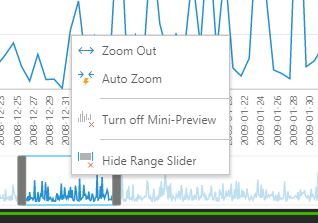
Zoom Out
Zoom all the way out to include the entire data range:
Auto Zoom
Zoom in, letting Pyramid decide the zoom size:
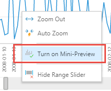
Mini Preview
Turn off
Remove the mini preview of the chart from the range slider, which frees up space on the canvas:
Turn on
Turn the mini preview back on opening the slider's context menu and selecting 'Turn on Mini-Preview':